This is a space for you to shove comments on figures as per requests
Figure 1 - Liquefaction
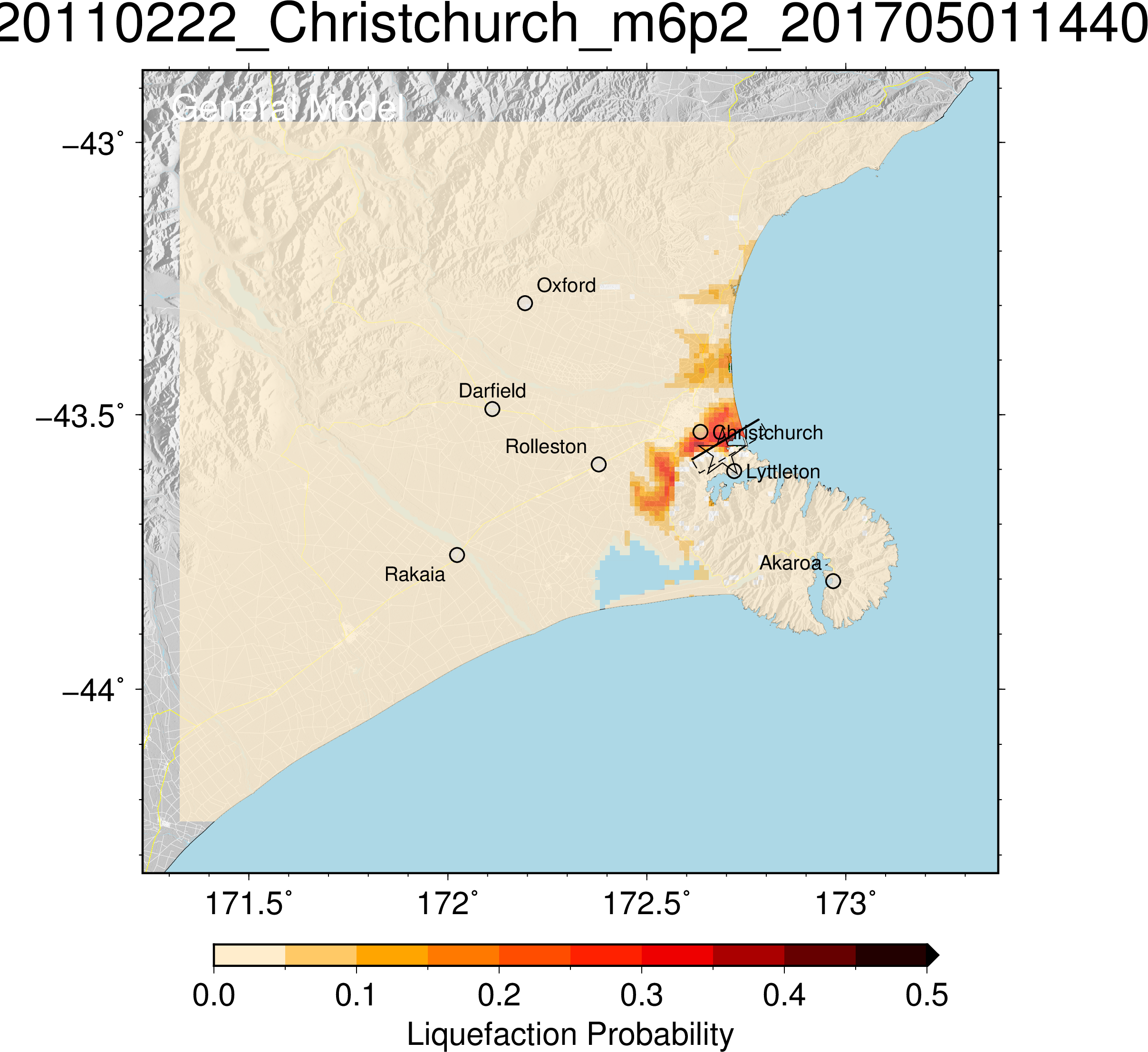
- The star indicates the earthquake location but it's a little clippy on the box
- The box indicates fault plane which doesn't seem particularly useful to the public; perhaps a fault line could be useful but the idea of the slip plane is very hard to get from a 2D picture
- Probability goes from 0 to 0.5, which is strange; we had liquefaction so surely that should be probability 1?
- No mention of severity or effects; only probability (although perhaps the graph is a combination of both?)
- The graph is oddly zoomed out (no effects in Rakaia, Oxford, etc) and could do with a compass as well
Monica
The data is from the 22 February 2011 6.2 earthquake. Latitude and longitude form the x and y graph axis.
Liquefaction is localised to the general Christchurch area, extending north along the coast and south east to Lincoln. From the scale of this graph, it is difficult to determine which areas had the highest liquefaction probability. From this graph, the area with the highest probability is south eastern Christchurch.
Assume the liquefaction probability is measured as a (decimal) percentage. Maximum decimal percentage is 0.5. Does this mean a 50% probability of liquefaction in the worst affected areas?
This star represents the epicentre, and the line represents the Port Hills fault including the direction it slopes in. However, if I did not know this already I may not realise this just by looking at the graph.
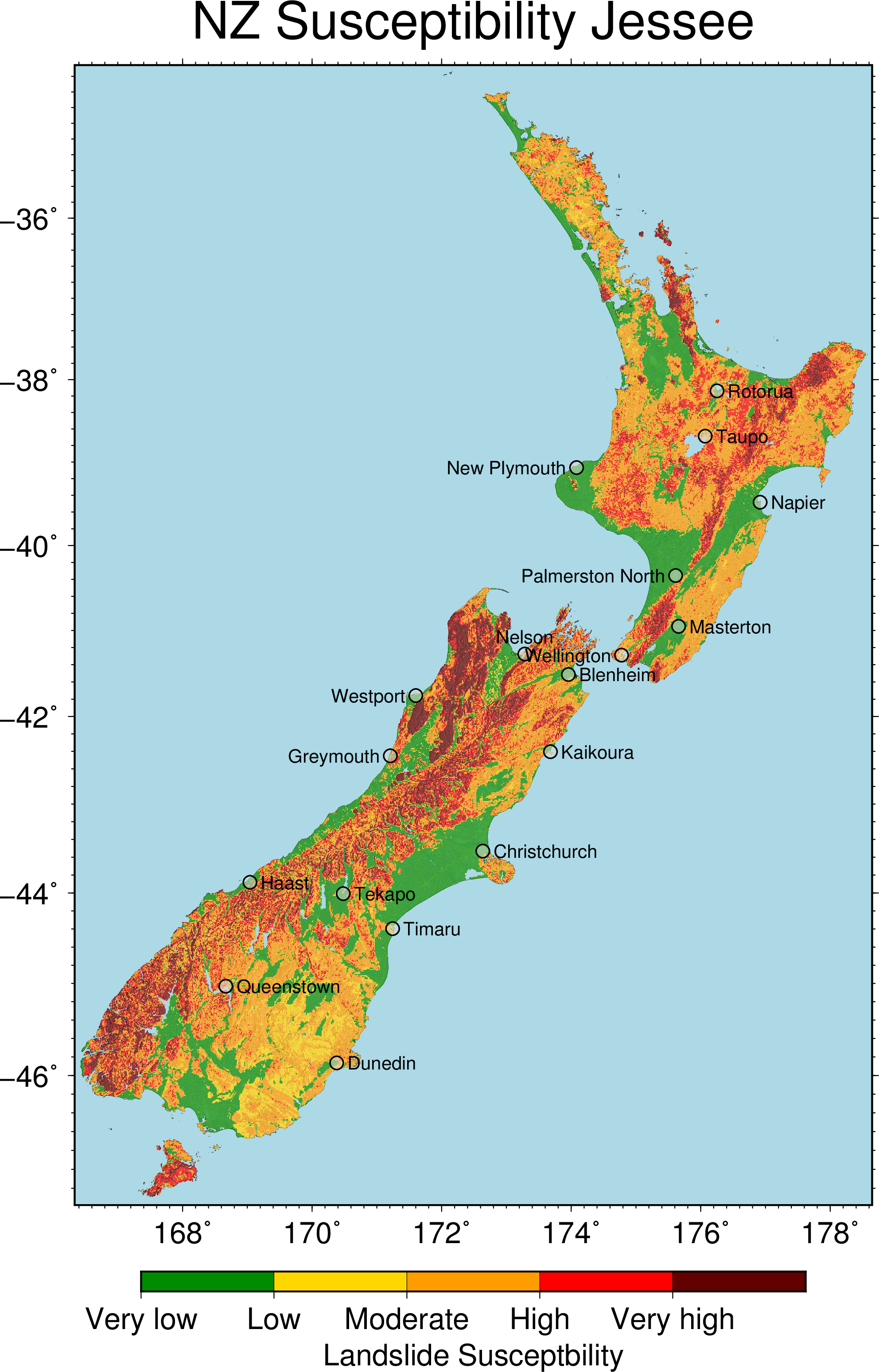
Figure 2 - Landslides
Monica
Red areas are more susceptible to landslides.
Only small areas of New Zealand have very low or low susceptibility.
From this graph we do not know if this susceptibility arises from earthquakes, weather events, erosion etc.
The areas that are more susceptible are hilly/mountainous areas.
This graph is relatively easy to understand with no previous experience or understanding.
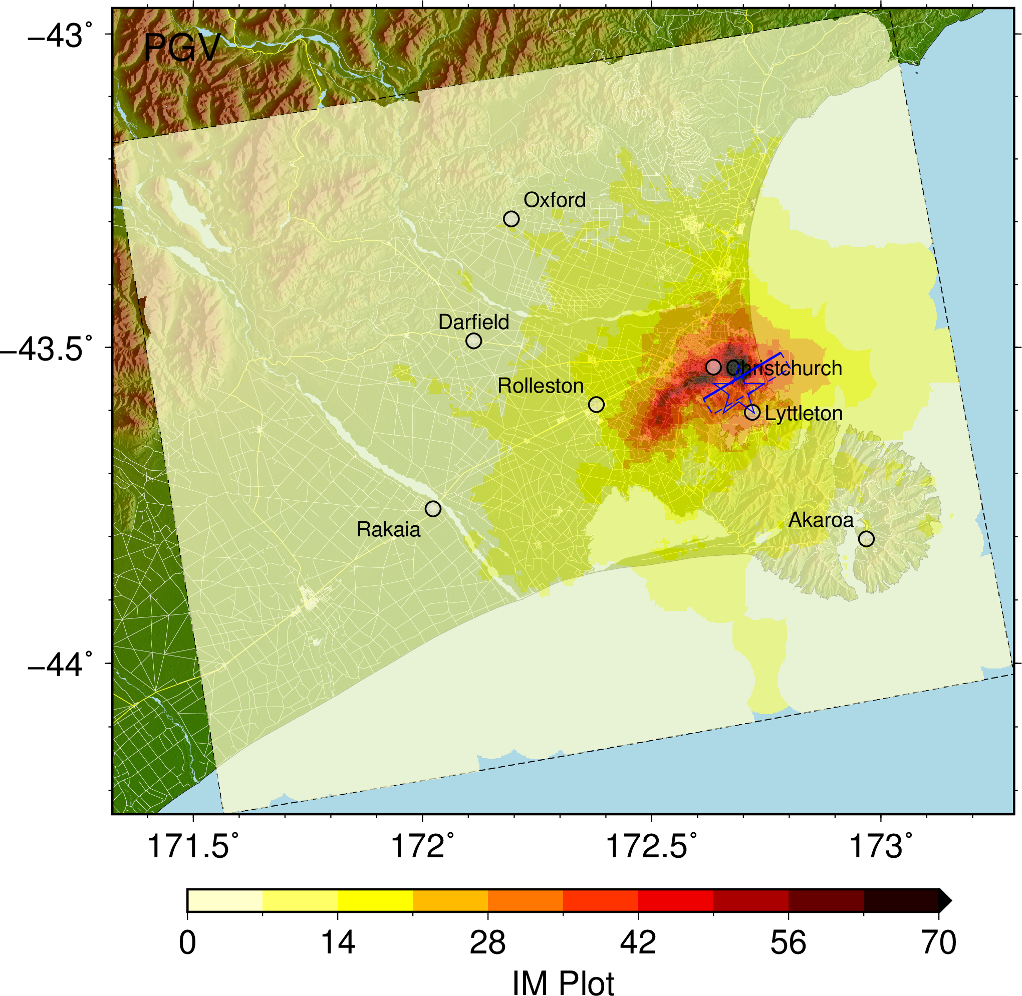
Figure 3 - What even is this
Monica
Very similar to the liquefaction probability graph, but this graph is looking at IM. What is IM? Do not know just by looking at the graph. Assume it refers to ‘intensity measure’.
But which intensity measure is the graph referring to? How is it relevant to shaking? What is the scale that has been used? Colour scale ranges from 0 to 70. Assuming 70 is ‘worse’. IM could be something like MMI, and provide a way of understanding how badly an area was affected, taking into account the shaking and impact on infrastructure. However, ‘PGV’ is written in the top left hand corner of the figure which should stand for peak ground acceleration. This would make sense in this case. The highest PGV was experienced in the eastern parts of the city.
Video comments
Monica
The animation first shows the Christchurch area from above. It also shows the Port Hills fault and how it slopes downwards below the ground. The length is shown relative to the city but the depth and angle are unknown. A colour scale shows the amount of slip that occurred along the faultline, ranging from 0 cm (white) to 100 cm (black). The scale is used to project the slip that occurred along a two-dimensional plane. An extension of the scale shows that the amount of slip extended to 214 cm but this is not shown on the fault plane. From the graph, it is unknown whether this more extreme value is localised or the scale simply does not extend beyond 100 cm. The variation of slip within the fault plane appears to be relatively random.
The earthquake then commences and this is shown by the slip along the fault and the start of ground motion in the Heathcote area. Ground velocity rapidly increases in the surrounding area, spreading outwards from the epicentre. Ground velocity appears to be greater north of the Port Hills. The shaking dissipates over time and continues to spread away from the epicentre. The shaking appears to be ‘stuck’ north of Christchurch around Amberley. The main period of shaking seems to last about 20 seconds.