Not current version at the moment
This is a space for you to shove comments on figures as per requests
Figure 1 - Liquefaction
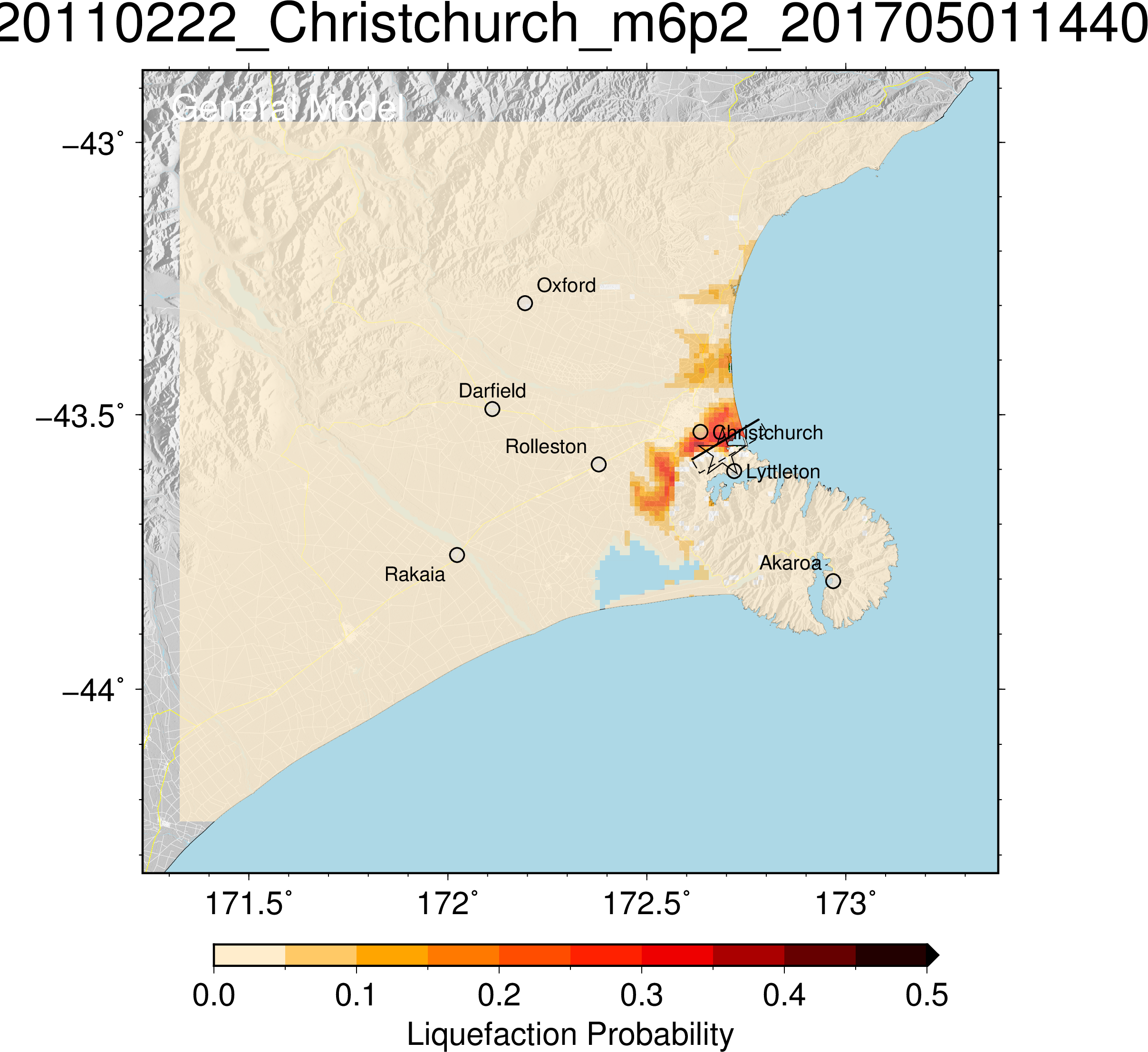
- The star indicates the earthquake location but it's a little clippy on the box | This star represents the epicentre, and the line represents the Port Hills fault including the direction it slopes in. However, if I did not know this already I may not realise this just by looking at the graph.
- The box indicates fault plane which doesn't seem particularly useful to the public; perhaps a fault line could be useful but the idea of the slip plane is very hard to get from a 2D picture
- Probability goes from 0 to 0.5, which is strange; we had liquefaction so surely that should be probability 1? | Assume the liquefaction probability is measured as a (decimal) percentage. Maximum decimal percentage is 0.5. Does this mean a 50% probability of liquefaction in the worst affected areas?
- No mention of severity or effects; only probability (although perhaps the graph is a combination of both?)
- The graph is oddly zoomed out (no effects in Rakaia, Oxford, etc) and could do with a compass as well
Monica
The data is from the 22 February 2011 6.2 earthquake. Latitude and longitude form the x and y graph axis.
Liquefaction is localised to the general Christchurch area, extending north along the coast and south east to Lincoln. From the scale of this graph, it is difficult to determine which areas had the highest liquefaction probability. From this graph, the area with the highest probability is south eastern Christchurch.
T
Kilian
This liquefaction map shows the probability of liquefaction occurring in Christchurch. Unfortunately there is very little information about the scale, although I am assuming that it goes up to a maximum likelihood of 1, which is a certain occurrence. There also doesn’t seem to be any information about severity, or which factors were included in the production of this figure, which is disappointing. In general, a member of the public wouldn’t get much information out of this figure except where locations of possible liquefaction. You can easily tell that the locations of likely liquefaction are very isolated and mainly focused near the ocean. The highest liquefaction probability is around 40% and located in the eastern part of Woolston. This is most likely because the soils near the surface are saturated due to their proximity to the ocean (as they lie beneath the water table).
Claire
Without any collaboration or research, it was observed that the liquefaction probability is about 20 – 30 % around the Christchurch region which covers most of the centre city. Some areas have reached a probability of 35 – 40 %. Liquefaction occurs during the earthquake shaking, when the wet soils lose their strength and pore water pressure builds up. The water then forced up to the ground surface along with the soils which behave like liquid. The liquefaction potential normally depends on the soil type and strength, groundwater level, and the earthquake location and strength. The main soil types in Christchurch are sandy and silty soils (susceptible soils) which put Christchurch in high potential of liquefaction. The ground surface tilts and sinks during liquefaction which will cause the damages to the infrastructures, buildings and roads, especially in population intense area.
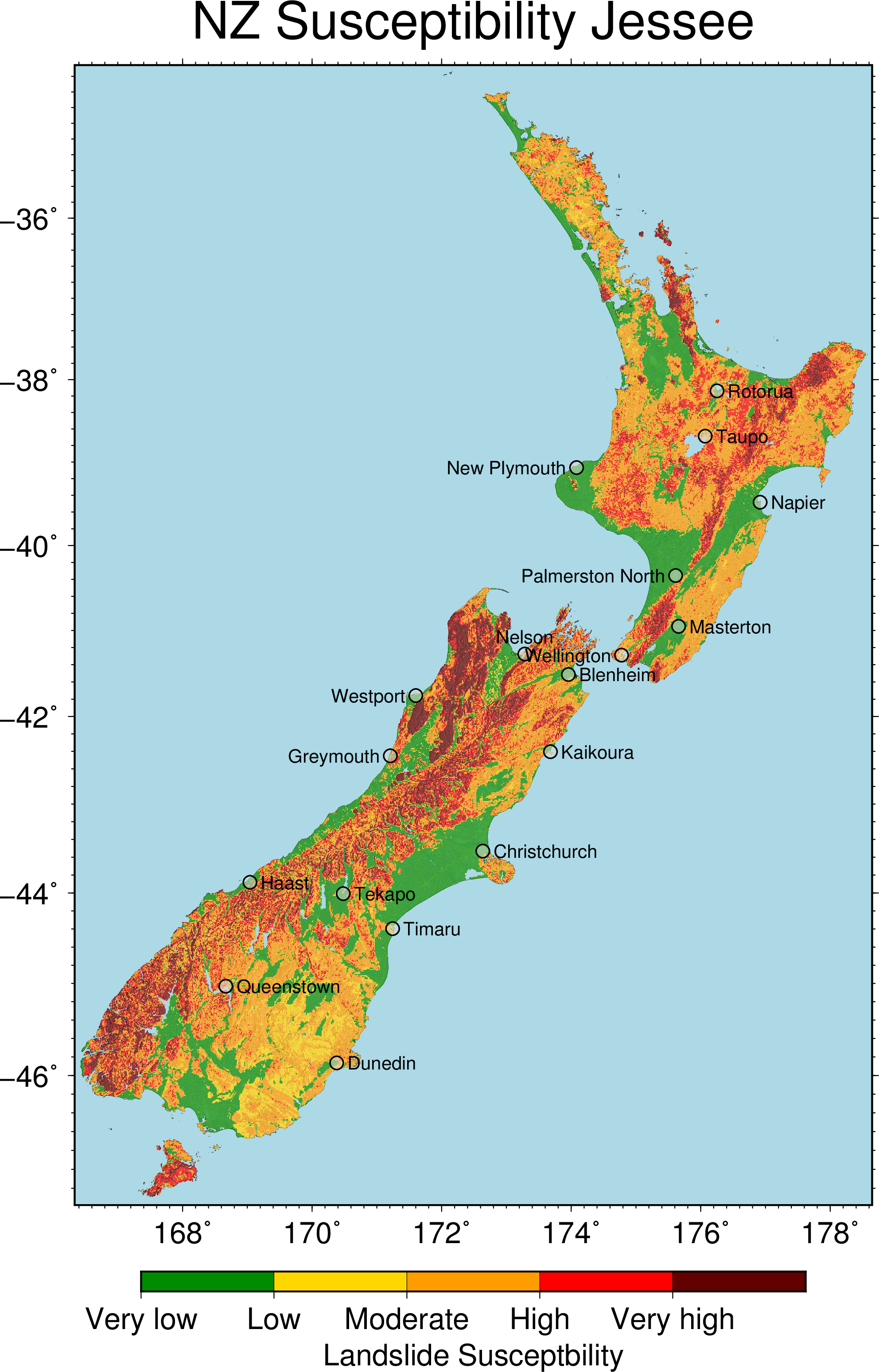
Figure 2 - Landslides
Monica
Red areas are more susceptible to landslides.
Only small areas of New Zealand have very low or low susceptibility.
From this graph we do not know if this susceptibility arises from earthquakes, weather events, erosion etc.
The areas that are more susceptible are hilly/mountainous areas.
This graph is relatively easy to understand with no previous experience or understanding.
Kilian
This map of landslide susceptibility again doesn’t give much information. The scale seems very relative in this instance, and a probability scale as in the liquefaction map would have been more helpful. In addition, it would have been nice to get some information about not only the landslide susceptibility but also severity. In general however, areas most susceptible to land sliding are mountainous regions. Areas like the Canterbury plains and other flat on the other hand have very low landslide susceptibility due to their small slope angles.
Claire
The figure indicates that the landslide susceptibility is moderate to high over the Banks Peninsula which is a peninsula of volcanic origin on the east coast. As shown in the a screenshot of the google earth map, the susceptible landslide area overlaps with the Banks peninsula where the mass movements are more likely to occur due to slope instability. Most of the Christchurch is subjected to very low landslide susceptibility. However, Port hills are located right beside the city which could be a potential hazard when landslides occur.
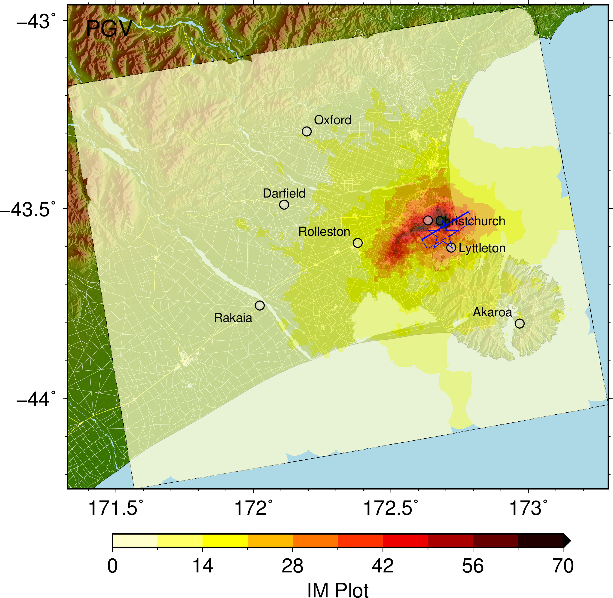
Figure 3 - What even is this
Monica
Very similar to the liquefaction probability graph, but this graph is looking at IM. What is IM? Do not know just by looking at the graph. Assume it refers to ‘intensity measure’.
But which intensity measure is the graph referring to? How is it relevant to shaking? What is the scale that has been used? Colour scale ranges from 0 to 70. Assuming 70 is ‘worse’. IM could be something like MMI, and provide a way of understanding how badly an area was affected, taking into account the shaking and impact on infrastructure. However, ‘PGV’ is written in the top left hand corner of the figure which should stand for peak ground acceleration. This would make sense in this case. The highest PGV was experienced in the eastern parts of the city.
Kilian
The PGV plot gives a visual representation of the peak ground velocities experienced during the 2011 Christchurch earthquake. There is some type of scale on the bottom but this doesn’t have any units attached so it seems fairly useless. IM most likely stands for intensity measure, which takes into account natural hazards and properties which are relevant to earthquake response, i.e. the ground and its motion during an earthquake. It appears that the size of the peak ground velocity decreases as you move away in all directions from the epicentre. This of course makes sense as the energy of the earthquake is dissipated as the seismic waves’ travel distance increases.
Video comments
Monica
The animation first shows the Christchurch area from above. It also shows the Port Hills fault and how it slopes downwards below the ground. The length is shown relative to the city but the depth and angle are unknown. A colour scale shows the amount of slip that occurred along the faultline, ranging from 0 cm (white) to 100 cm (black). The scale is used to project the slip that occurred along a two-dimensional plane. An extension of the scale shows that the amount of slip extended to 214 cm but this is not shown on the fault plane. From the graph, it is unknown whether this more extreme value is localised or the scale simply does not extend beyond 100 cm. The variation of slip within the fault plane appears to be relatively random.
The earthquake then commences and this is shown by the slip along the fault and the start of ground motion in the Heathcote area. Ground velocity rapidly increases in the surrounding area, spreading outwards from the epicentre. Ground velocity appears to be greater north of the Port Hills. The shaking dissipates over time and continues to spread away from the epicentre. The shaking appears to be ‘stuck’ north of Christchurch around Amberley. The main period of shaking seems to last about 20 seconds.
Kilian
The earthquake animation is probably the best visual representation for communication to the public as it allows you to see what magnitude of motion the ground is experiencing where and when. The only point of confusion is the multitude of scales which appear at the bottom of the video during its duration and also the fault plane seems a little out of place and doesn’t seem to add much useful information. The largest ground motion seems to occur to the north of the earthquake epicentre. In addition to this, it appears that the seismic waves either travel slower in the northbound direction, or that they are generated for a longer period in that direction, because the area just north of the epicentre is moving much longer than the area just south.